
Grow, cook, eat, arrange
With Sarah Raven & friends
Welcome to Grow, cook, eat, arrange, the weekly podcast from gardener, writer, teacher and cook, Sarah Raven.
Since the publication of her first book, The Cutting Garden, two decades ago, Sarah has led the way by introducing a new kind of productive gardening which places emphasis on intense colour, sophistication, and achievability. With special guests from across garden design, floristry, food, ecology, conservation, and more, this podcast is brimming with top tips and helpful hints to help you create your most productive garden ever.


About the Sarah Raven podcast
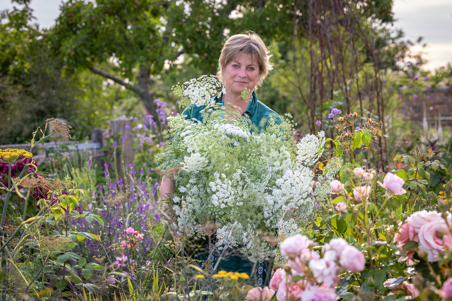
Welcome to grow, cook, eat, arrange, the weekly podcast from gardener, writer, teacher, and cook, Sarah Raven.
Over the last two decades, Sarah has led the way by introducing a new kind of productive gardening which places emphasis on intense colour, sophistication, and achievability.
Recorded at the beautiful Perch Hill Farm in Sussex, Sarah talks with special guests from across garden design, floristry, food, ecology, conservation, and more.
Brimming with top tips and helpful hints, listen and learn how to create your most productive garden ever.
Enjoy the show!
-
What is a podcast?
A podcast is similar to a radio programme, but you can listen to it at any time. Many people listen to podcasts while doing something else, either gardening, cooking or travelling.
-
How often are episodes released?
Each Friday a new episode will be released. Each episode is around 25-30 minutes. You can also listen to past episodes by following this link: All Episodes
-
Why should I subscribe to follow the podcast?
If you subscribe to a podcast it will be easy to find in your app and each episode will automatically download ready for you to listen to each week.
-
How can I listen?
The podcast can be found on our web page sarahraven.com/podcast and you can link to it on the arrow below, but many people find the easiest way to listen to podcasts is via one of the free podcast apps available on smartphones.
• Download a podcast app such as Spotify
• Open the app
• Set up an account if you don’t already have one
• Go to the search function and type in ‘Sarah Raven’
• Select the Sarah Raven podcast
• Look for a button to ‘Subscribe’ or ‘Follow’
• Once you have subscribed the podcast will automatically appear in your library (look for the stacked book symbol)
• To listen to an individual episode simply tap on it